Instagram’s use of fonts plays a vital role in its user experience, from the clean interface to engaging visual content. Understanding the fonts Instagram uses can help you design a visually appealing Instagram presence or simply appreciate the platform’s design.
In this article, we’ll explore the primary fonts used on Instagram, including the introduction of Instagram Sans, its system fonts like San Francisco and Roboto, and how these elements shape the app’s look.
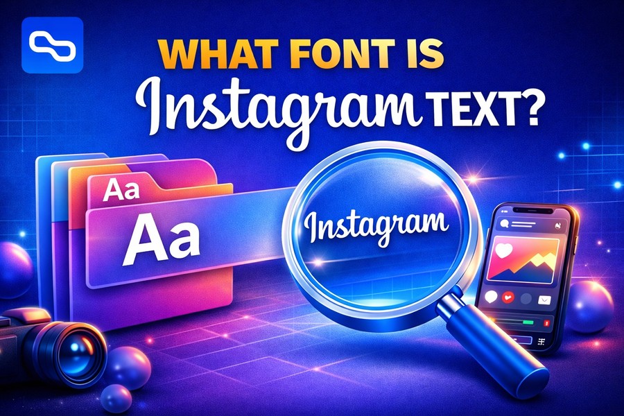
If you’ve ever wondered about Instagram’s typography and how it influences your content, you’re in the right place. Let’s dive into what makes Instagram’s font choices unique.
Instagram Sans: Instagram’s Custom Typeface
Instagram’s custom-designed font, Instagram Sans, is one of the platform’s most significant design decisions. Launched in 2022, it replaced Proxima Nova, which had been Instagram’s primary font for years. Instagram Sans was created to reflect the app’s personality and brand identity, providing a clean, modern look that scales well across different devices. The font’s design uses a geometric style with rounded corners, which makes it appear more approachable and friendly.
Instagram Sans is versatile, allowing for clarity and legibility while maintaining its modern aesthetic. Whether in stories, posts, or captions, the font adjusts to different sizes without losing its impact. One of the key elements of Instagram Sans is its ability to make both text-heavy content and visually dynamic elements cohesive. Instagram’s decision to move away from third-party fonts and develop a custom one also means that the platform has full control over its visual identity.
You can spot Instagram Sans on both iOS and Android devices, though the platform also adapts depending on the system’s font settings. If you’re interested in experimenting with this style, consider using Instagram’s font generator to replicate it for your own social media profiles.
Instagram’s System Fonts for iOS and Android
Beyond its custom font, Instagram relies on system fonts that are tailored for different operating systems. On iOS devices, Instagram uses San Francisco, Apple’s system font, which is optimized for high readability and crisp clarity across all Apple devices. This font adapts to various screen sizes and resolutions, ensuring that Instagram’s text looks sharp and easy to read on iPhones, iPads, and other Apple devices.
On Android devices, the platform uses Roboto, Google’s system font designed to maintain clarity and consistency across various Android-powered devices. Roboto is widely regarded for its friendly and approachable design, making it ideal for apps like Instagram that require a balance between aesthetics and functionality.
Both San Francisco and Roboto are chosen to ensure Instagram’s text looks consistent across devices and operating systems. These fonts are simple yet effective in helping users engage with Instagram content in an intuitive, seamless way.
Instagram Stories and Custom Font Styles
When it comes to Instagram Stories, the platform offers a wide range of customizable fonts. These fonts allow you to personalize your stories and make them stand out. Instagram offers several options, including Classic, Modern, Neon, Typewriter, and Strong.
Each of these fonts has its own character, offering different moods and tones. For example, the Neon font is bold and vibrant, perfect for eye-catching designs, while the Typewriter font gives a vintage, nostalgic feel. Instagram’s flexibility in font choices allows users to express themselves creatively, enhancing the overall user experience.
Interestingly, Instagram doesn’t just offer these fonts for Stories—it also integrates them into other types of posts. The Modern and Strong fonts, for example, are often used in text overlays for photos and videos, further ensuring that Instagram maintains its reputation for being visually engaging and user-friendly.
For those looking for even more flexibility, third-party tools and font generators can be used to apply custom fonts that resemble Instagram’s design. These tools help users create unique text styles for their bio, captions, and other posts, aligning with Instagram’s core aesthetic while maintaining personal creativity.
The Evolution of Instagram’s Logo Typeface
Instagram has undergone several logo redesigns, and with each update, the font in the logo has evolved as well. Initially, Instagram used a Billabong script for its logo when the platform launched in 2010, reflecting a casual and playful tone. However, as the platform grew, the need for a more modern and streamlined font became apparent.
In 2016, Instagram underwent a significant redesign. The logo was simplified to a minimalist sans-serif font that matched the platform’s clean and sophisticated look. This updated logo was paired with the new Instagram Sans font, marking a shift toward a more professional and cohesive visual identity.
Today, the Instagram Sans font is synonymous with the brand. It is used in the app’s logo, website, marketing materials, and most internal communications. Instagram’s logo font plays a crucial role in conveying the brand’s identity—modern, approachable, and globally recognized.
Instagram has also made the font available for commercial use through external designers, allowing businesses and individuals to align their brand typography with Instagram’s visual identity. This accessibility to Instagram Sans makes the font a popular choice for any design aimed at appealing to Instagram’s large, social media-savvy audience.
Fonts Beyond Instagram Sans
While Instagram Sans dominates Instagram’s core design, the platform still employs various fonts in specific contexts. For instance, text in Instagram’s Explore section and advertisements may use variations of the default font to fit the platform’s evolving needs. This flexibility in typography helps Instagram adapt to different contexts, ensuring that each element of the app is aligned with its overall design ethos.
The use of third-party fonts, such as Helvetica Neue or Proxima Nova, is still visible in older posts, ads, and certain branding materials. However, Instagram has steadily moved away from third-party fonts in favor of creating a unified, in-house typeface—Instagram Sans—helping the platform retain full control over its visual identity.
Fonts in Instagram Captions and Bio
When it comes to Instagram captions and bios, the default text is either Roboto or San Francisco, depending on your device. However, many Instagram users personalize their profiles by using font generators to create custom text styles that reflect their individuality. These text generators offer cursive, bubble, and bold styles, among others, helping users create unique bios that stand out.
These tools are widely used on Instagram to add flair to profiles. Many users have embraced creative fonts to showcase their personality, highlight important details, or make their bio more visually appealing. In fact, Instagram’s bio section has become one of the most popular places to experiment with these custom fonts.
Custom fonts give individuals and brands a way to differentiate themselves, making their posts and profiles more memorable to followers. Although Instagram doesn’t officially support custom fonts, using third-party tools lets users achieve their desired aesthetic while aligning with Instagram’s core design principles.
Why Instagram’s Font Choices Matter
The fonts Instagram uses are not just about aesthetics; they play a significant role in user engagement and brand perception. A clean, readable font, such as Instagram Sans, ensurescontent is easily accessible, whether you’re scrolling through your feed or creating new posts. These fonts enhance the user experience, making the app intuitive and pleasant to navigate.
Additionally, Instagram’s font choices reflect its brand values—modern, minimalistic, and approachable. By choosing fonts that align with these values, Instagram reinforces its identity and creates a cohesive experience for users worldwide. Whether on mobile devices or desktop, Instagram’s typography helps maintain consistency and ensures the platform remains user-friendly and visually appealing.
How to Use an Upside Down Text Generator for Your Posts
In case you are looking to get creative with your Instagram fonts and add some fun to your posts, you can use an upside down text generator to flip your captions and bios for added engagement!
This tool makes it easy to add quirky, eye-catching elements to your text, helping it stand out amid the sea of standard fonts on Instagram. Experimenting with upside-down text can be a playful way to catch your followers’ attention and add a unique flair to your content.
Conclusion
Instagram’s fonts, especially the introduction of Instagram Sans, play an integral role in shaping the app’s design and user experience. The combination of San Francisco and Roboto as system fonts for iOS and Android devices further ensures that the app remains accessible and visually consistent across platforms. Instagram’s focus on typography enhances both user interaction and brand recognition, making it one of the most engaging platforms in the world.
By experimenting with Instagram’s font options for Stories, captions, and bios, users can add a personal touch to their posts while staying true to the platform’s core design. Whether you’re a content creator or a casual user, understanding the role of Instagram’s fonts will help you create content that feels authentic and visually compelling.